


Explore Finishes · Stone & Alabaster Looks
How to Read Material, Glow, and Variation
A stone-like surface can describe natural material, a named stone, or a manufactured visual effect. The right choice begins by separating identity from appearance.
Choose the room mood first, but verify the material second. If the product page says Dolomite, call it Dolomite. If it says PMMA, Acrylic, Glass, Resin, or stone-pattern, treat it as a stone or alabaster look—not natural alabaster.
Stone and alabaster-look lighting can make a room feel grounded without making it dark. The attraction lies in a productive contradiction: a fixture can read as substantial when unlit, then appear lighter and more atmospheric when its shades begin to glow. In dining rooms, entries, bedrooms, and calm living spaces, that shift can feel more architectural than a clear sparkling surface and more tactile than a perfectly uniform white diffuser.
But the category is easy to misread online. “Alabaster” may name a natural material, describe a color, appear in a product title, or signal a visual effect. “Stone” may refer to a verified shade material, a stone-inspired texture, or the palette used in a staged room. None of those uses proves the others. A photograph can show veining, clouding, or a creamy glow; it cannot establish geology, composition, weight, fragility, quarry, treatment, or care.
WREA’s current relevant products illustrate the distinction. Three product pages used in this guide identify the shade material as Dolomite in their DETAILS fields. One of those titles includes “White Alabaster,” but its material field still says Dolomite. A separate stone-pattern ring chandelier identifies the shade as PMMA. The visual family may overlap; the factual descriptions should not.
01 · Material truth ledger
Read the evidence in the right order
Use this hierarchy whenever a product title, description, collection placement, and photography seem to point in different directions. The exact current product specification outranks appearance.
The named shade and frame material for the selected product page, plus current source, size, color, and care fields where listed.
Unlisted mineral type, origin, fabrication method, precise translucency, matching tolerance, or properties of every product in the collection.
Design intent, named visual effect, and the seller’s descriptive language for that fixture.
A stronger material claim when the description conflicts with DETAILS. “Marble-inspired” and “alabaster-style” remain appearance terms.
A useful catalog name for locating the product and understanding its intended aesthetic direction.
Geological identity. A title that contains alabaster, marble, brass, or stone is not a substitute for the material specification.
Visible shape, scale relationship, pattern placement in the photographed sample, lit/unlit presentation, and nearby room colors.
Natural versus manufactured composition, exact color in your room, structural condition, light output, or how another unit will vary.
02 · Glow layers
What you call “the glow” is a stack of decisions
The shade matters, but it does not work alone. A material can appear cool in daylight, warm after dark, softly patterned in one photograph, and higher-contrast in another. Read the four layers before deciding that a fixture is “too yellow,” “too dim,” or “not stone-like enough.”
Source and control
Start with the exact source type, published color-temperature options, output information if available, and compatible control. Integrated LED and replaceable bulbs create different service and selection questions.
Verify, don’t inferShade identity
Confirm whether the shade is Dolomite, natural alabaster, another named stone, glass, PMMA, acrylic, resin, or an unspecified material. Only then interpret appearance.
Material before moodPattern and thickness
Visible pale areas, darker lines, panel overlaps, edges, and local thickness can change how bright or patterned the shade looks. Product-specific photography is evidence of that sample, not a universal rule.
Expect local contrastRoom field
Wall paint, wood, metal, stone counters, daylight, camera white balance, and adjacent light sources can shift the perceived warmth and visual weight of the fixture.
Test in context03 · Unlit / illuminated
Approve both states, because the fixture lives in both
An unlit product view tells you how much pale material remains visible during the day. Look at the outline, panel rhythm, apparent opacity, metal boundary, and contrast with the ceiling. A fixture with many irregular panels may retain a strong sculptural presence even before it is switched on.
An illuminated room view shows a different hierarchy. Some panel areas become brighter; overlapping or visually denser areas may hold more shadow; the metal frame may recede or become a warm border. The photograph is still only one exposure. Use it to understand the type of change, not to promise an exact tone or brightness.
For a dining room, compare the fixture in morning daylight, at dinner, and after the surrounding lights are on. For an entry, include the view from outside the room. For a bedroom, check whether the brightest portions sit near normal sightlines. The goal is not maximum translucency. It is a stable composition across the hours when the room is used.


Detail-reading rule
Pattern is visible evidence; composition is a specification
This close view is useful for assessing the irregular outline, visible tonal movement, panel overlap, fasteners, and the relationship between pale shades and warm metal. It does not prove that the material is natural alabaster or marble.
For this exact product, the current DETAILS field identifies the shade as Dolomite and the frame as Copper. That is the language the article preserves. Stronger claims in a title or promotional description should be reconciled on the product page before publication, not amplified in editorial copy.
04 · Variation register
Variation can be character, mismatch, or a condition that needs review
Natural, formed, and hand-finished materials may show differences in color, pattern, texture, or formation. Manufactured stone-look surfaces can also vary by print, casting, finish, lighting, or production batch. The safe response is not to declare every difference “natural” or every difference a “defect.” First confirm the exact material and the product’s stated variation expectations.
Normal character
Subtle shifts in tone, line, clouding, edge shape, or panel-to-panel appearance may be consistent with the stated natural, formed, or hand-finished material. Confirm the page language and review the full composition rather than one isolated mark.
Coordination question
A difference may be acceptable on one chandelier but distracting across a pair, a long row, or an open-plan view. Ask how several shades or fixtures will be visually coordinated when matching matters.
Condition review
Cracks, loose components, sharp damage, instability, electrical problems, or transit damage should not be dismissed as “variation.” Stop installation where safety may be involved and send clear photographs and order details for review.
05 · Visual weight
Let the room decide how much mineral presence it needs
Pale architectural field
White or plaster-like walls can make pale shades quieter in outline. Use warm metal, panel edges, or a clearly scaled silhouette to prevent the fixture from disappearing.
Wood and warm neutrals
Wood can echo the warmth of a glowing pale shade. Keep the number of competing grains and veins controlled so the chandelier remains legible as one form.
Dark or high-contrast field
A darker background can make every irregular edge and bright panel more visible. This can feel architectural, but it also increases apparent contrast and demands careful seated-view testing.

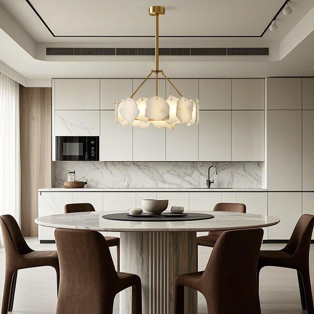
A stone or alabaster-look fixture already contains visual information: pale mass, internal pattern, irregular edges, or repeated panels. Pairing it with heavily veined stone counters, bold wood grain, limewash, textured rugs, and patterned art can produce a richly layered room—but only if one surface leads.
Choose the hierarchy deliberately. If the chandelier is the mineral focal point, reduce competing vein scale behind it. If a dramatic stone wall or island is the main event, consider a simpler shade rhythm, a smaller body, or a finish that gives the fixture a clean perimeter. Do not match veins literally. Coordinate temperature, contrast, and visual density.
Scale remains separate from material. A pale fixture can still feel visually heavy when it has a deep body, many panels, or a low position. Use the WREA Size & Installation Guide to review room and fixture dimensions, then have a licensed electrician verify the exact mounting, support, wiring, electrical compatibility, and local requirements.
06 · Purchase verification
Six questions to settle before a stone-like fixture enters the room
What is the exact shade material?
Record the current DETAILS wording. Do not replace Dolomite with alabaster, marble, or generic natural stone; do not replace PMMA, acrylic, glass, or resin with stone.
Which images are lit and unlit?
Compare a clean product view, a close material view, and a room view. Ask what color temperature was used when that information affects your decision.
How much variation is expected?
For natural, formed, or hand-finished components, ask about the expected range and coordination of multiple pieces. For manufactured looks, ask about color and pattern consistency.
What are the exact dimensions and source?
Confirm width or length, depth, body height, drop range, source type, controls, serviceability, and published output where available.
What care method is approved?
Follow the exact product instructions. The three WREA Dolomite examples below currently say to turn off power and wipe with a dry cloth; do not add cleaner or moisture unless approved.
What requires professional review?
Fixture weight, junction box, structural support, mounting, ceiling condition, wiring, driver or dimmer compatibility, access, and local code belong in the installation plan.
Where the product page is incomplete or internally inconsistent, pause. Send WREA the exact product link, desired variant, room photographs, measurements, ceiling information, and the specific material or matching question. “Is this real alabaster?” is too broad without a SKU; “The current DETAILS field says Dolomite—can you confirm the selected 32-inch Copper version uses Dolomite shades and explain expected panel variation?” is answerable.
Verified WREA examples
Three Dolomite directions, three different room relationships
All facts below come from the current product DETAILS fields. The article does not generalize Dolomite properties beyond those pages or convert title language into a stronger alabaster or marble claim.

Linear field · Verified Dolomite
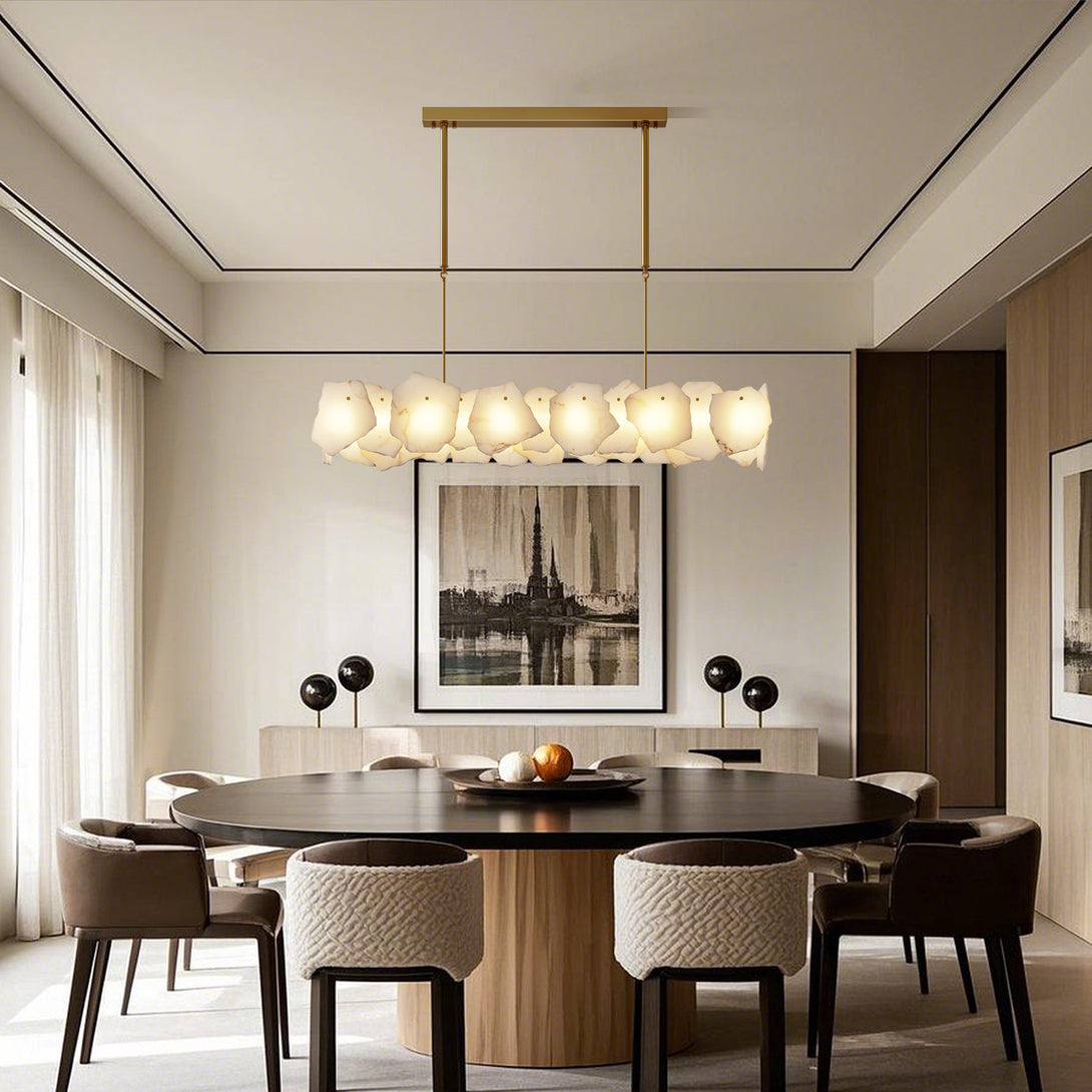
Linear Rectangle Brass Natural Dolomite Petal Chandelier
For a long dining table or elongated furniture axis. Current page: 39- and 47-inch sizes; Copper, Nickel, and Black options; Copper frame; Dolomite shade; integrated LED; 3-step 3000K/4000K/6000K listing.
Review current details →
Round petal field · Verified Dolomite
Round Brass Natural Dolomite Petal Chandelier
A center-oriented composition with a broader size range. Current page: 16-, 26-, 32-, and 39-inch sizes; Copper, Nickel, and Black options; Copper frame; Dolomite shade; integrated LED; 3-step 3000K/4000K/6000K listing.
Review current details →
Panel ring · Verified Dolomite
Brass Round Natural Dolomite White Alabaster Chandelier
The title includes “White Alabaster,” while current DETAILS identify the shade as Dolomite. Current page: 24- and 32-inch sizes; Copper, Nickel, and Black options; Copper frame; integrated LED; 3-step 3000K/4000K/6000K listing.
Review current details →Stone & alabaster-look FAQ
Questions that prevent material disappointment
Is every “alabaster” light made from natural alabaster?
No. Alabaster may be a verified material, a color, a style word, or part of a product name. Confirm the exact shade material for the selected SKU. Do not infer natural stone from a creamy color, veining, translucency, price, or title.
Is Dolomite the same as natural alabaster?
Do not use the terms interchangeably. They are different material names. If a WREA product DETAILS field says Dolomite, describe that product as Dolomite unless verified documentation states something more specific and consistent.
Will natural stone shades match the product photo exactly?
Do not expect a line-for-line match when the product documentation states natural material and variation. Ask about the expected range of tone, pattern, and panel coordination. Photography, display settings, and room light can also change perceived color.
Why can a pale stone-like shade look warmer when lit?
The source color, control setting, shade identity, visible pattern, thickness, overlap, nearby finishes, daylight, and camera processing all influence perception. Confirm the exact fixture and review both lit and unlit imagery.
Does a stone or alabaster-look chandelier provide enough task light?
The appearance of a glowing shade does not establish measured output or task performance. Review published source and output information for the exact product, then plan ambient, task, and accent layers for the room’s real activities.
How should I clean stone or stone-look lighting?
Follow the selected product’s instructions. Do not transfer a marble-counter cleaner, acrylic polish, glass cleaner, or generic stone treatment to a fixture. De-energize the light and use safe access; ask the seller when the material or care direction is unclear.
Material + room review
Begin with the room, then verify every material word
Send the exact product link, selected size and color, room dimensions, ceiling height, lit and unlit reference images, surrounding finishes, and any matching or variation concern. WREA can help separate the visible look from the facts that still need confirmation.


